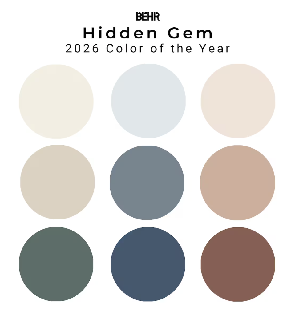
🎨 2026 Paint Trends and Why Paint Is the Smartest Pre Listing Upgrade
If there is one update that consistently delivers high emotional impact with low cost, it is paint. Before a home hits the market, buyers want to walk in and feel calm, welcomed, and inspired. Paint creates that feeling faster than almost any renovation.
And in 2026, the design conversation is shifting from “neutral and safe” to warm, layered, retreat style living.
Designers are leaning into earthy tones, deep moody colors, and softer neutrals that create comfort and connection rather than sterile perfection. Think mushroom, clay, taupe, sage, terracotta, and warm whites replacing icy grays and stark white palettes. Just look at the Pantone color of the year: Cloud Dancer, a soft lofty white.
The goal is simple:
👉 create a home that feels like a personal sanctuary
👉 help buyers emotionally move in before they physically do
✨ 2026 Paint Color Trends Buyers Are Loving
1. Warm neutrals (the new safe choice)
- Creamy whites
- Soft beige and greige
- Mushroom tones
- Khaki and taupe
These colors feel timeless but still warm and layered. Paint brands are highlighting soft whites and earthy neutrals as foundational shades that pair easily with bold accents. Just google search Behr or Sherman Williams if you need a ready to go 2026 paint swatch.
2. Nature inspired retreat tones
- Olive green
- Sage
- Smoky jade
- Terracotta
- Warm eucalyptus
These shades connect interiors to nature and support the wellness driven design movement. If you already have fresh paint in your home, how about adding a feature area with big bold plants? Bring the color into the room with plants, throw pillows and empty space. (yes, decluttering brighten rooms)
3. Moody and dramatic colors
- Espresso browns
- Mahogany
- Deep greens
- Near-black with warm undertones
Designers predict rich dark colors will replace flat black because they feel sophisticated and dimensional. This is showing up in bathroom fixtures and tile, it brings a level of luxury to the space.
4. Muted blues
- Sky blue
- Blue gray
- Teal infused blues
These tones feel soft and calming and pair beautifully with wood and neutral finishes. Don’t want to paint a wall sky blue? Think about how you can brighten a room with window treatments, plants, or a fabulous rug.
🏡 Why Paint Is the Best Upgrade Before Listing
Paint delivers three major selling advantages:
✔ Creates instant move in appeal
Fresh paint signals care and maintenance.
✔ Makes rooms feel larger and brighter
Light reflection and cohesive color flow improve perceived space.
✔ Helps buyers imagine their lifestyle
Color influences emotion, which drives buying decisions.
Paint also allows sellers to “neutralize personalization” without stripping personality.
🌿 Creating a Retreat Style Home Oasis
2026 design is heavily influenced by wellness spaces. Buyers want homes that feel restorative.
To achieve that:
- Use soft layered neutrals as the base
- Add a deeper accent tone for intimacy
- Incorporate natural textures (wood, stone, linen)
- Use color drenching (walls + trim + doors same tone)
Even painted interior doors are trending as a simple way to add character and depth.
🌙 The Dark Ceiling Trend (and when it works)
Yes, dark ceilings are absolutely having a moment.
They work best when:
- Ceilings are tall
- You want a cozy, cocoon effect
- The room has strong natural light
- The goal is drama or intimacy
Dark ceilings visually lower height slightly and create a boutique hotel feeling.
Great pairings
- Dark green ceiling + warm cream walls
- Espresso ceiling + taupe walls
- Smoky navy ceiling + mushroom walls
Pro tip
Use a satin or matte finish to avoid glare and highlight architectural depth.
🎯 How To Keep Undertones Coordinated Throughout the Home
This is where most paint plans go wrong.
Every paint color has an undertone:
- warm (yellow, red, orange)
- cool (blue, green, violet)
- neutral
The rule
👉 choose ONE undertone direction for the main living spaces
If floors are warm oak, cabinets are creamy, and countertops have gold veining, lean warm.
If floors are gray washed and cabinets are bright white, lean cool.
Consistency creates flow and makes homes feel larger.
🪵 Should You Choose Paint Based on Floors and Cabinets?
Short answer: yes, always start with fixed finishes.
Paint is flexible. Floors and cabinetry are expensive to change.
Step by step designer approach
- Identify undertone in flooring
- Identify undertone in cabinetry
- Look at countertop veining
- Choose paint that harmonizes (not matches)
For example:
- Warm wood floors → warm whites, taupe, sage
- Gray floors → soft greige, muted blues
- Dark cabinets → creamy whites or soft contrast tones
- Light cabinets → deeper walls for balance
This layered harmony helps buyers perceive quality and intentional design.
💡 Pro Tips Before Painting for Resale
✔ Paint whole home color flow, not individual rooms
Buyers love cohesion.
✔ Avoid bold personal colors in main areas
Save personality for powder rooms or offices.
✔ Use the same trim color throughout
Consistency equals perceived luxury.
✔ Sample paint in multiple lighting conditions
Morning, afternoon, and evening lighting shift undertones.
✔ Don’t forget ceilings and doors
These are often missed opportunities for subtle design impact.
❤️ Final Thought
Paint is not just cosmetic.
It is emotional staging.
In 2026, the most successful listings will not feel staged or sterile. They will feel warm, intentional, layered, and restorative. Painting your home before listing can help create a buyer’s emotional connection to your home.
That is what buyers are responding to.


COMMENTS